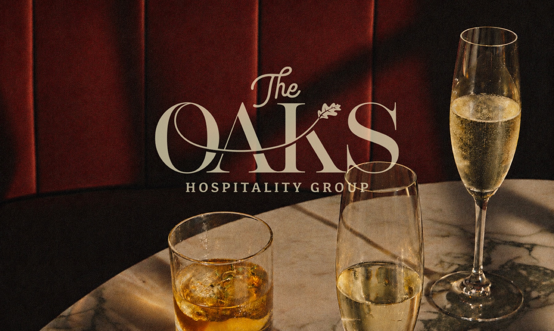
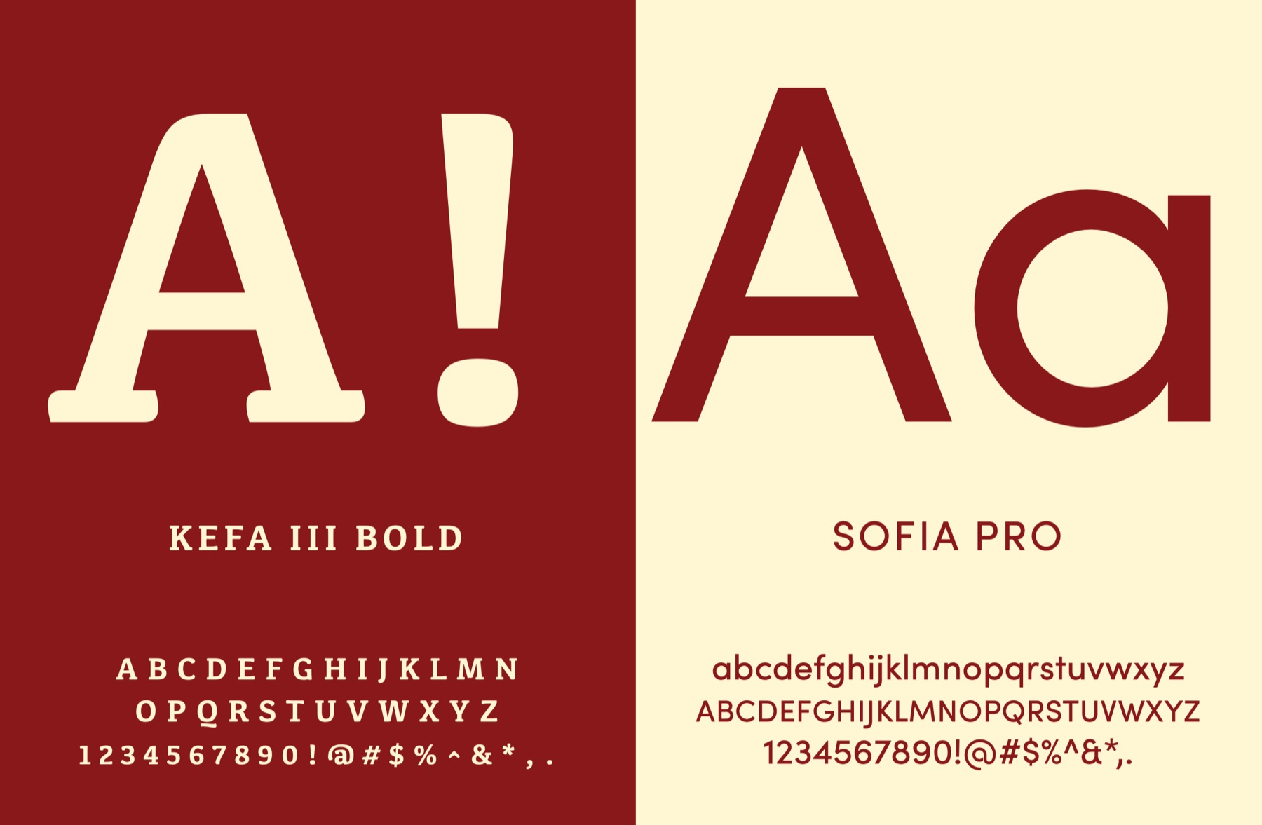
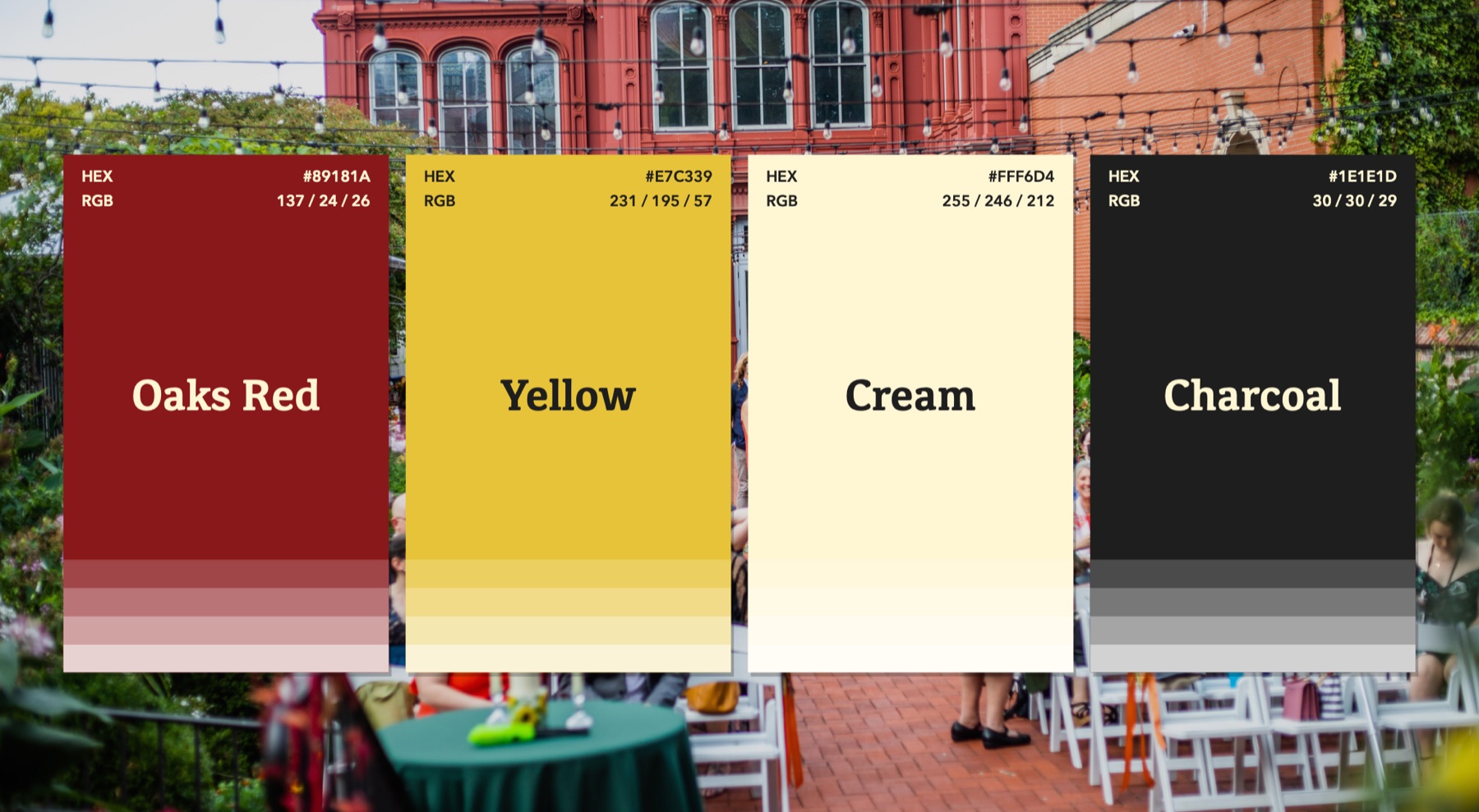
I developed a cohesive visual identity for The Oaks Hospitality Group, bringing a distinctive character to the details of the guest experience. The project explored how a shared brand language could connect hospitality spaces, printed materials, packaging and digital communications. I built the identity around an expressive wordmark, a rich color palette and an organic pattern, creating a recognizable foundation that could adapt across a range of applications.
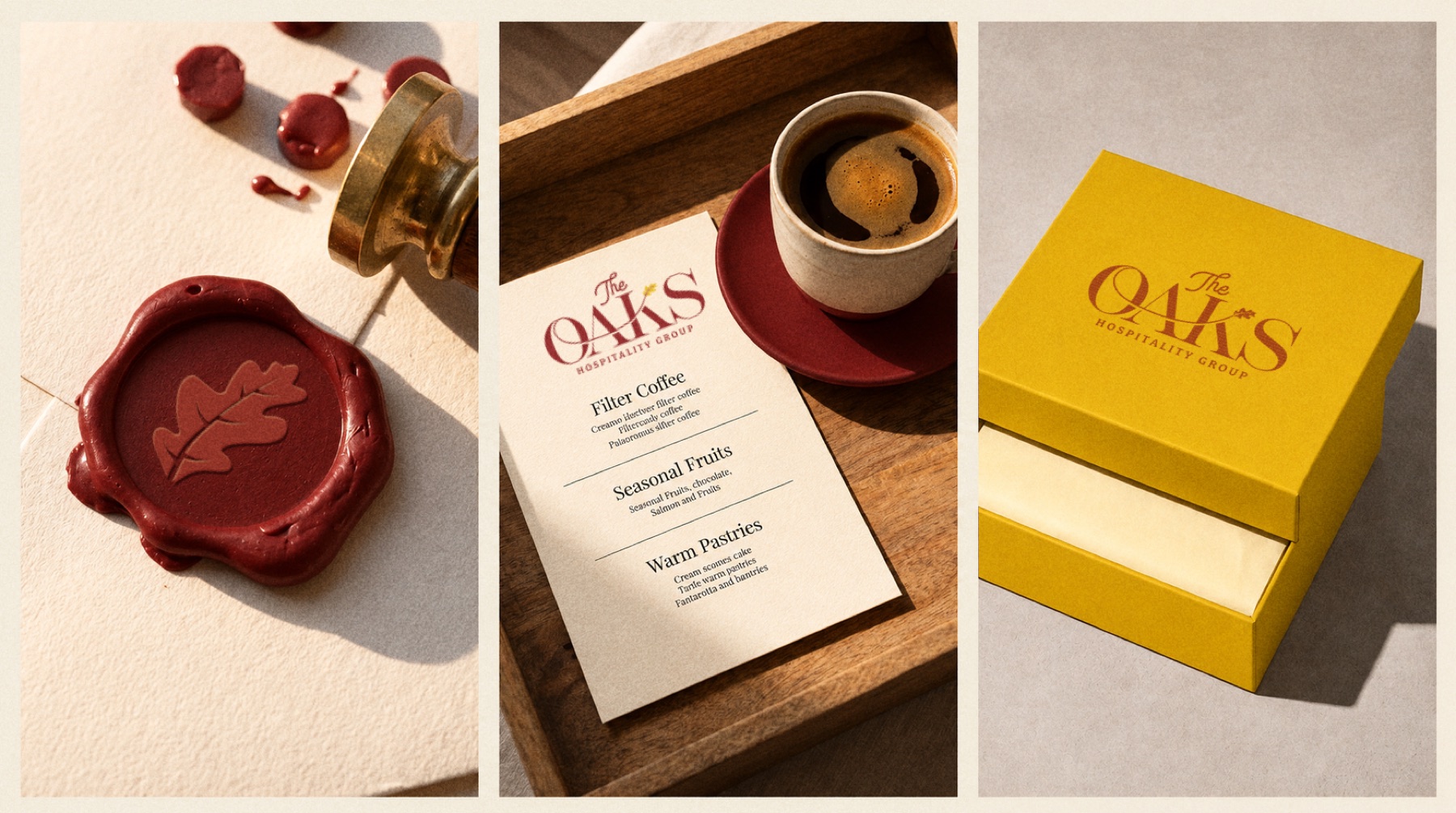
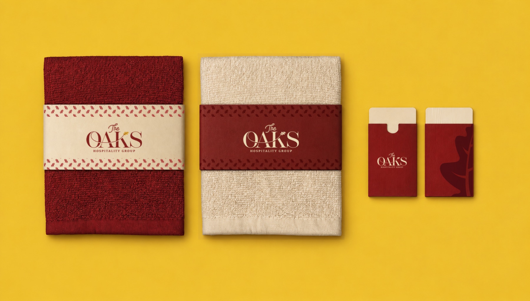
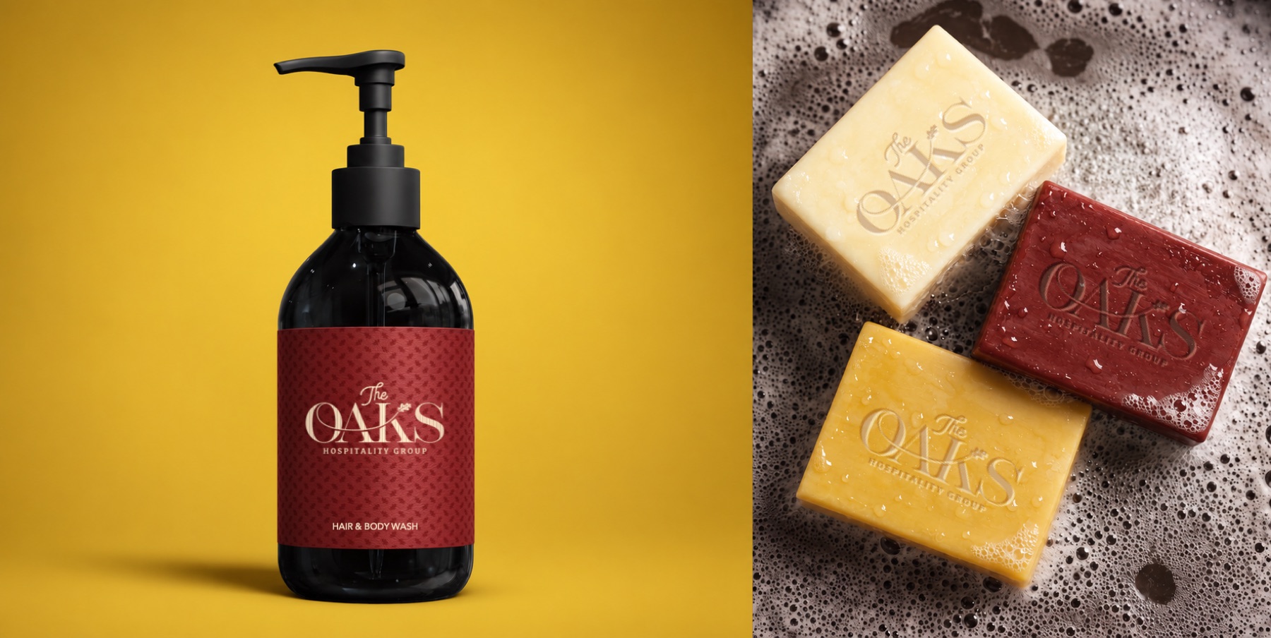
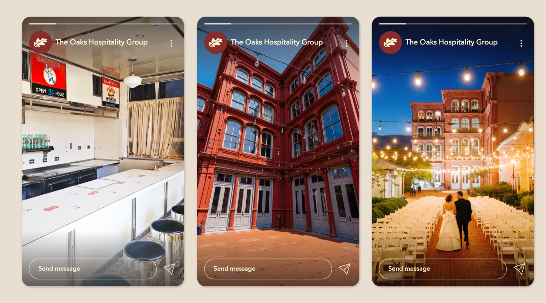
I carried the system into menus, bath amenities, soap cartons, towel packaging, embroidered textiles and social media layouts. Each application balances the character of the identity with clear typography and thoughtful spacing, allowing the brand to feel connected without making every piece identical. The mockups show how the system can extend from a small label to a hospitality setting, presenting a consistent visual direction across physical and digital touchpoints.
I developed a cohesive identity for The Oaks Hospitality Group, connecting its visual character across guest amenities, packaging, menus and digital communications. I can help your hospitality brand create a consistent, memorable presence through thoughtful identity design and considered details that carry across the guest experience.